The Anatomy of a High Converting B2B SaaS Landing Page
January 11, 2025
Most landing page advice is broken in a very specific way. It tells you to do things—add social proof, write a clear headline, include a call-to-action—without ever explaining why those things work, when they don't work, and how to think about them in the context of what you're actually selling.
The problem isn't that the advice is wrong. The problem is that the advice is surface-level. It's the equivalent of telling a new chef to "add salt" without explaining what salt does chemically, how different dishes require different amounts, and how oversalting at the wrong moment can ruin everything you've built.
What I want to do in this piece is different. I want to take a single landing page—one I built for my own product—and tear it apart from the inside. Not just what each section does, but why it exists, what psychological mechanism it triggers, how the copy was constructed, and how you can reverse-engineer the same principles for whatever you're building.
The page in question is for Analyze AI (tryanalyze.ai), an AI search analytics platform. But the principles here are transferable to almost any B2B SaaS.
The anatomy we'll cover—hero, product visualization, problem agitation, solution framework, manifesto, case studies, features, resources, and CTA blocks—represents what I believe is the optimal structure for converting cold traffic into warm leads. Not because I invented it, but because each piece serves a specific function in the buyer's psychological journey, and removing any of them creates friction that kills conversions.
Let me show you how the pieces fit together.
The Problem With Generic SaaS Landing Page Templates And What A High Converting Landing Page Looks Like
The standard SaaS landing page template looks something like this: Hero → Features → Pricing → Testimonials → CTA. Some variations add a "How it Works" section or throw in a logo bar. But the fundamental structure is the same, and it's built on a flawed assumption: that visitors arrive ready to evaluate your product and just need information to make a decision.
That assumption might have been true in 2015. It's demonstrably false now.
Today's B2B buyer arrives with noise in their head. They've seen seventeen tools that claim to do what you do. They've been burned by software that promised transformation and delivered incrementalism. They're skeptical, distracted, and operating on borrowed attention. You have maybe five seconds to prove you're not wasting their time, and another thirty seconds to prove you understand their world better than the alternatives.
The anatomy I'm proposing is built for this reality. It's designed to earn trust before asking for anything. It's structured to answer objections in the order they naturally arise. And it's optimized for the way people actually consume pages—which is to say, non-linearly, with heavy skimming at the top and deeper engagement only if the early sections earn it.
Here's the key insight: the top of your page does the heaviest psychological lifting. By the time someone reaches your features section, they've already decided whether you're worth considering. The features are just confirmation. If your hero and problem sections haven't done their job, nothing downstream will save you.
This is why the anatomy front-loads persuasion and back-loads information. Persuasion (hero, product viz, problem, solution, manifesto) comes first because it creates the emotional frame that makes information meaningful. Information (features, FAQ, resources) comes second because it validates the emotional decision the visitor has already begun to make.
Most landing pages get this backwards. They lead with what the product does instead of why it matters. They assume rational evaluation when the actual process is emotional conviction followed by rational justification.
The below anatomy fixes this. Here's at a glance what it looks like.
- Hero — The first five seconds. Answers "what is this and why should I care?"
- Product visualization — Shows the thing. Answers "what does this actually look like?"
- The problem — Agitates the pain. Answers "why is my current situation broken?"
- The solution — Positions your approach. Answers "how do you solve this differently?"
- Manifesto — Declares values. Answers "what do you believe that others don't?"
- CTA block — Breaks up the scroll. Captures high-intent visitors who've seen enough.
- Case study — Proves results. Answers "has this worked for someone like me?"
- Testimonial — Social proof from a real human. Answers "do real people trust this?"
- Main features — Shows capabilities. Answers "what specifically can I do with this?"
- More features — Goes deeper. Captures the thorough researcher.
- Resources + FAQ — Provides value and handles objections. Answers "what else should I know?"
- Final CTA + Footer — Last chance to convert.
Section 1: The Hero
The hero is where most landing pages die. Not because founders don't understand its importance—everyone knows the hero matters—but because they misunderstand what the hero is supposed to accomplish.
The hero has one job: to create a moment of recognition. The visitor should land on your page and, within seconds, think: "This is for me. They get my problem. I should keep reading."
That's it. The hero is not about explaining your product. It's not about listing features. It's not even about being clever. It's about creating resonance.
What the Analyze Hero Does
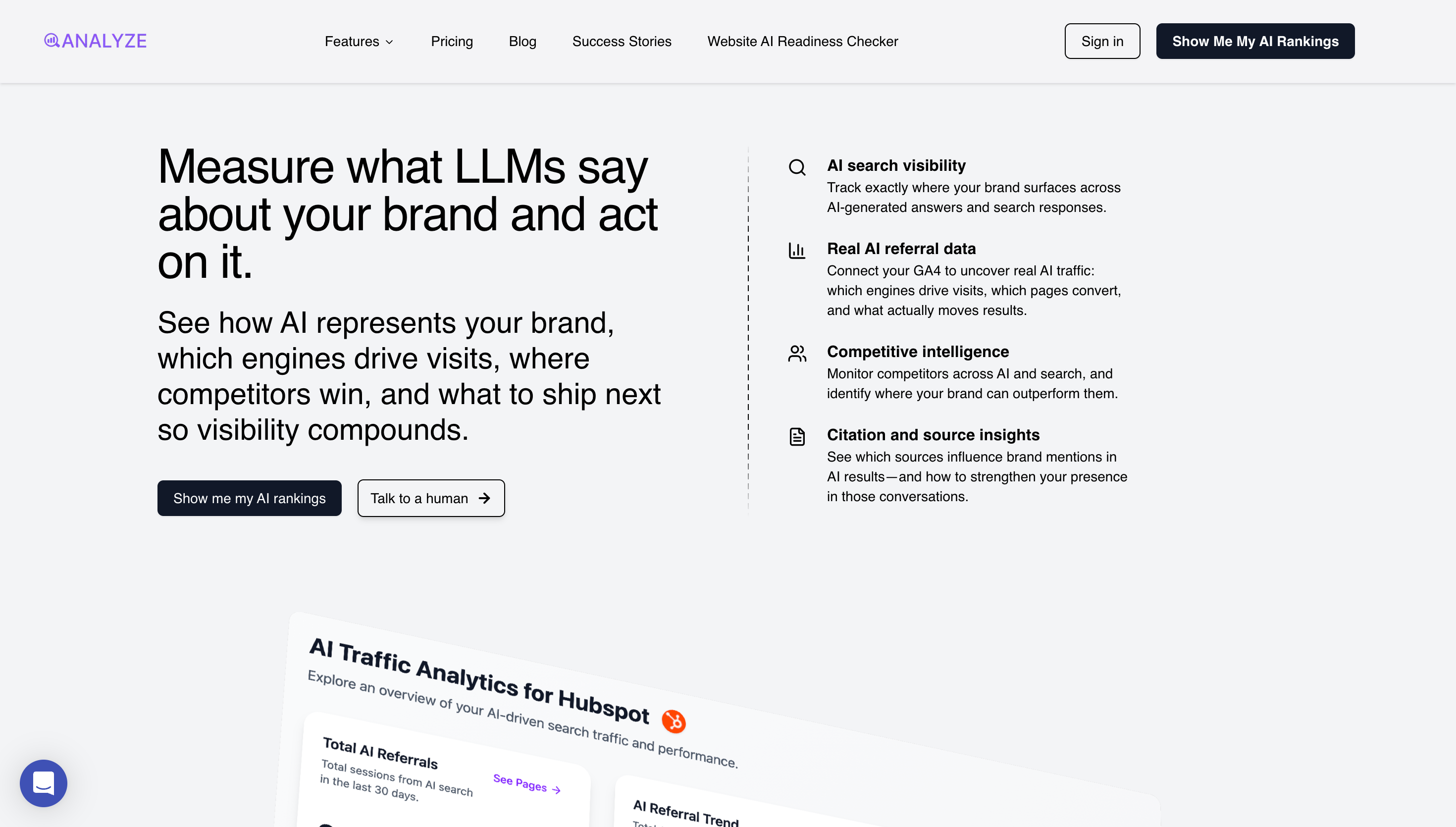
The headline reads: "Measure what LLMs say about your brand and act on it."
This is doing several things simultaneously:
First, it signals a new category. Most visitors have never thought about measuring what LLMs say about their brand. The headline creates a new frame—one where AI-generated answers are a thing to be measured, understood, and influenced.
Second, it implies a problem. The very idea that you'd need to measure what LLMs say about you suggests that what they're currently saying might be a problem. This is more effective because it lets the visitor fill in the gap with their own specific fears.
Third, it promises action. "And act on it" tells you this isn't just another dashboard for vanity metrics. There's an output, a workflow, something you can do with the data. This addresses the latent objection that analytics tools often generate reports no one reads.
Fourth, it qualifies the audience. If you don't have a brand, or you don't care what AI systems say about it, this page isn't for you. That's intentional. The headline filters out visitors who would never convert anyway, saving everyone time.
The Supporting Copy
Beneath the headline: "See how AI represents your brand, which engines drive visits, where competitors win, and what to ship next so visibility compounds."
This is the elaboration layer. It takes the headline's promise and makes it concrete with four specific outcomes:
- How AI represents your brand — brand monitoring
- Which engines drive visits — traffic attribution
- Where competitors win — competitive intelligence
- What to ship next — strategic guidance
The Call-to-Action
Two buttons: "Show me my AI rankings" and "Talk to a human."
This dual-CTA approach is critical and frequently botched. Here's why it works:
The primary CTA ("Show me my AI rankings") is product-first. It promises an immediate, tangible output. You click it and you get something—not a demo request form, not a sales call calendar link, but an actual result. This dramatically lowers the perceived commitment and raises the perceived value.
The secondary CTA ("Talk to a human") is for visitors who don't click the primary CTA but aren't ready to leave. These are often enterprise buyers who need to talk before they do anything. Giving them an explicit path acknowledges that different buyers have different buying processes.
The mistake most pages make is having either one CTA (leaving the other buyer type without a path) or two CTAs that compete for the same action (which creates confusion and decision paralysis).
The Feature Bullets
On the right side, four capabilities:
- AI search visibility
- Real AI referral data
- Competitive intelligence
- Citation and source insights
Framework to Use to Nail Your Landing Page Hero Sections
If you're building your own hero, here's the formula:
Headline: [New frame] + [Implied problem] + [Action/outcome]
Subhead: [Specific outcome 1] + [Specific outcome 2] + [Specific outcome 3] + [Compounding/benefit language]
Primary CTA: [Verb] + [Immediate, tangible value] — not "Get started" or "Sign up"
Secondary CTA: [Alternative path for different buyer] — typically sales-touch for complex products
Feature pills: [3-5 capability categories] — just enough to prove substance
Mistakes to Avoid
- Don't be clever at the expense of clarity. Puns, metaphors, and wordplay in headlines almost always reduce conversion. Your visitor gives you five seconds. Don't make them work to understand what you do.
- Don't optimize for everyone. A headline that tries not to alienate anyone will resonate with no one. Strong positioning necessarily excludes some people. That's a feature, not a bug.
- Don't use "We help X do Y." This construction puts your company as the subject. The visitor doesn't care about your company. They care about their own problems. Make them the subject.
- Don't hide the CTA. The button should be visible without scrolling on desktop and within the first screenful on mobile. Visitors who are ready to act shouldn't have to hunt for how.
Section 2: Product Visualization
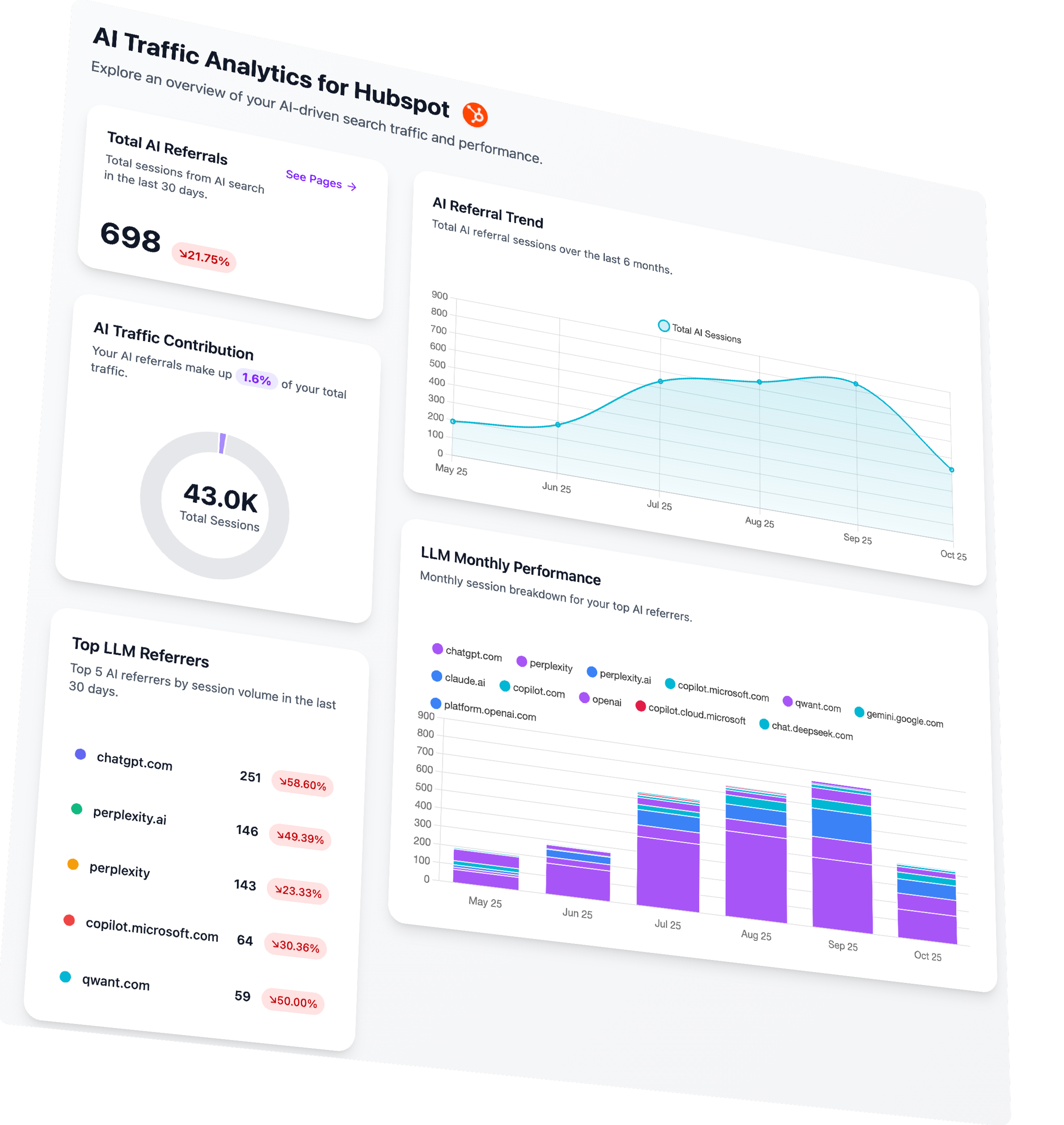
Immediately below the hero, you show the product.
The Analyze page shows a dashboard titled "AI Traffic Analytics for Hubspot" with four key components:
- Total AI Referrals: 698 sessions (down 21.75%)
- AI Traffic Contribution: 1.6% of 43.0K total sessions
- AI Referral Trend: A chart showing growth from May to October
- LLM Monthly Performance: A legend showing which engines (ChatGPT, Perplexity, Claude, Copilot, Gemini) are driving traffic
Why This Product Visualization Style Works
Most visitors have never seen your product. They have no mental model for what it looks like in practice. The product visualization creates that mental model.
This is especially important for new categories. When you're selling something people already buy (like a CRM or email tool), they can imagine the interface because they've used similar products. When you're creating a new category (like AI search analytics), you need to build that picture for them.
The visualization also serves as credibility. A real product has a real interface. Showing the interface, even in mockup form, proves you've built something.
Visitors are pattern-matching for signals that you're legitimate, and a detailed dashboard mockup is one of the strongest signals you can provide.
Key elements of the visualization and why it works:
Branded example: The screenshot says "for Hubspot" and uses the Hubspot logo. This isn't because the product only works for Hubspot—it's because using a specific, recognizable brand makes the example feel concrete and real. "AI Traffic Analytics for [Your Brand]" is abstract. "AI Traffic Analytics for Hubspot" is tangible.
Real-looking data: The numbers (698, 21.75%, 43.0K, 1.6%) look like actual metrics, not placeholder zeros or suspiciously round figures. This attention to detail signals that the product generates real outputs.
Trend visualization: The chart showing growth over time is perhaps the most important element. It implies that the data has time-series depth, that you can track progress, that the product provides ongoing value rather than one-time insight.
Engine breakdown: Showing specific AI platforms (ChatGPT, Perplexity, Claude, Copilot, Gemini) establishes that the product has genuine depth. These aren't generic "AI engines"—they're the specific players that savvy marketers recognize.
Framework to Use For Your Product Images/Visualization
When creating your product visualization:
Use a specific, recognizable brand in your example. Don't use "Acme Corp" or "Sample Company." Use a real brand that your target audience respects. (Get permission or make it clear it's illustrative.)
Include realistic numbers. Generate or use actual data that looks like real performance metrics. Avoid round numbers and zeros.
Show the core value metric prominently. What's the one number users most care about? Put it front and center.
Include time-series data. A chart showing change over time implies ongoing value and stickiness.
Show the platforms/integrations/sources relevant to your category. This proves depth and establishes category knowledge.
Mistakes to Avoid
- Don't use actual screenshots of early-stage UI. Unless your interface is genuinely polished, mockups beat screenshots. Visitors judge UI aesthetics harshly, and a rough screenshot can undermine credibility.
- Don't show too much. The visualization should be scannable in about two seconds. If it's too detailed, visitors won't parse it and will scroll past.
- Don't make it generic. Specificity is the key to believability. Every element should feel like it could be real.
Section 3: The Problem
This is where the real persuasion begins.
The problem section's job is to make the visitor feel the pain of their current situation more acutely than they felt it before landing on your page. Not invent new pain—articulate existing pain that they couldn't quite put into words.
What the Analyze Problem Section Does
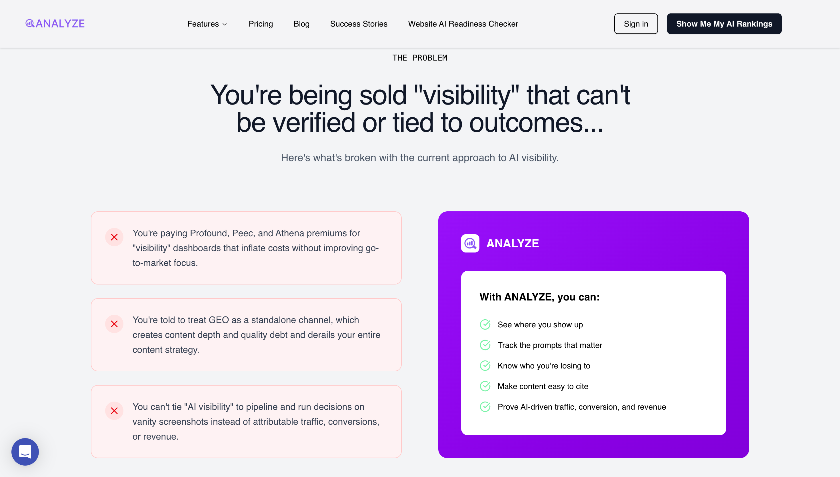
The headline: "You're being sold 'visibility' that can't be verified or tied to outcomes..."
Subhead: "Here's what's broken with the current approach to AI visibility."
Then three specific pain points:
- "You're paying Profound, Peec, and Athena premiums for 'visibility' dashboards that inflate costs without improving go-to-market focus."
- "You're told to treat GEO as a standalone channel, which creates content depth and quality debt and derails your entire content strategy."
- "You can't tie 'AI visibility' to pipeline and run decisions on vanity screenshots instead of attributable traffic, conversions, or revenue."
Psychological Principles I Used In This Section
Problem agitation: The visitor arrives with latent dissatisfaction. Your job is to make that dissatisfaction acute, to put language to feelings they couldn't articulate, to show them their situation is worse than they thought.
In-group signaling: By naming specific competitors and failure modes, you signal that you understand the space deeply. Visitors who recognize the references feel understood. This builds trust.
Loss aversion: The problems are framed around what visitors are losing—money, strategic clarity, measurement capability. Humans are more motivated by loss prevention than gain acquisition. Framing problems as losses amplifies urgency.
Why This Problem Section Works
Naming competitors is polarizing and effective. Most founders are terrified to name competitors. They use euphemisms like "other solutions" or "traditional approaches." Analyze names Profound, Peec, and Athena directly. This serves multiple purposes: it signals confidence, it helps visitors with competitor experience feel immediately understood, and it creates contrast that makes your positioning sharper.
The problems are specific and operational. These aren't vague pain points like "difficulty tracking ROI" or "complex reporting." They're specific failure modes that anyone who's tried these alternatives will recognize. "Vanity screenshots" is particularly effective—it evokes the exact experience of presenting meaningless dashboards in stakeholder meetings.
Each pain point targets a different failure mode. Point one is about cost without value. Point two is about strategic confusion. Point three is about measurement impossibility. Together they paint a comprehensive picture of why the current paradigm is broken.
The language is confrontational. "You're paying premiums." "You're told to treat." These are direct, accusatory constructions that force the visitor to reckon with their situation. Softer language would let them off the hook emotionally.
The Contrast Panel
Adjacent to the pain points, a panel shows what Analyze offers instead:
- See where you show up
- Track the prompts that matter
- Know who you're losing to
- Make content easy to cite
- Prove AI-driven traffic, conversion, and revenue
Framework to Nail Your Problem Section
Here's how to build your own problem section:
Headline formula: [You're experiencing X] + [that can't/doesn't achieve Y]
Lead into specific pain points with: "Here's what's broken with [current paradigm]."
Pain point formula: [Specific situation you're in] + [tool/method you're using] + [specific failure mode] + [downstream consequence]
Name competitors if you can. Yes, this is aggressive. Yes, it works. The visitors who would be put off by competitor criticism weren't going to buy your product anyway.
Use the Contrast Panel: Show your solution approach directly adjacent to the problems. Don't make visitors scroll to see the alternative.
Mistakes to Avoid
- Don't be vague. "Many companies struggle with analytics" does nothing. "You're paying $30K/year for dashboards that can't tie to pipeline" does everything.
- Don't make up problems. If you articulate pain that visitors don't actually feel, you lose credibility. The problems must be real and recognizable.
- Don't be so aggressive you become unlikable. There's a line between confident and arrogant. Naming competitors is fine; mocking them is not.
- Don't forget the contrast. Agitating problems without offering an alternative just makes visitors depressed. Always pair problems with the possibility of resolution.
Section 4: The Solution
If the problem section is the wound, the solution section is the bandage.
But not just any bandage—a bandage that reveals how you think about healing differently from everyone else.
What the Analyze Solution Section Does
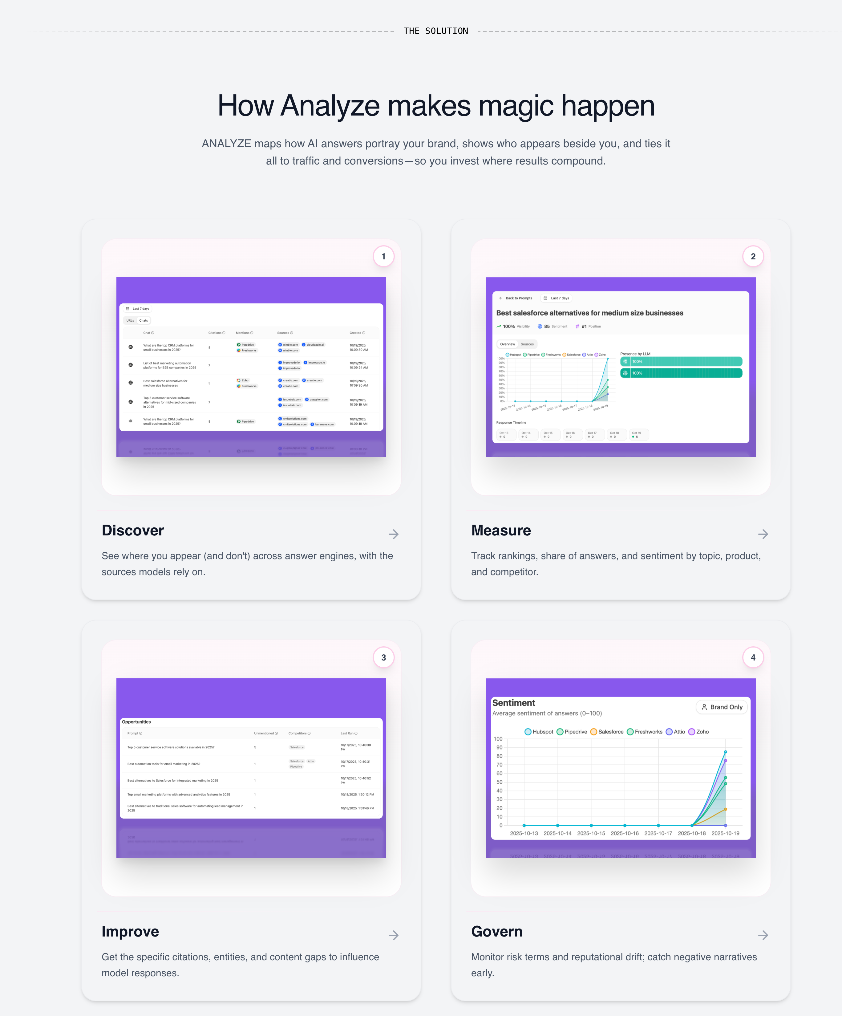
Header: "How Analyze makes magic happen"
Subhead: "ANALYZE maps how AI answers portray your brand, shows who appears beside you, and ties it all to traffic and conversions—so you invest where results compound."
Then four capability quadrants:
- Discover: "See where you appear (and don't) across answer engines, with the sources models rely on."
- Measure: "Track rankings, share of answers, and sentiment by topic, product, and competitor."
- Improve: "Get the specific citations, entities, and content gaps to influence model responses."
- Govern: "Monitor risk terms and reputational drift; catch negative narratives early."
Psychological Principles I Used For This Solution Section
Completeness bias: Humans are drawn to things that feel whole. A product with one capability feels limited. A product with a logical progression of capabilities feels comprehensive.
Progressive disclosure: The quadrant structure lets visitors grasp the high-level approach quickly while signaling there's depth if they want it. Each quadrant can expand into features later.
Workflow alignment: By mapping your capabilities to how visitors actually work, you make adoption feel natural. They're not learning a new paradigm; they're applying their existing paradigm to a better tool.
Why This Solution Quadrant Framework Works
This Discover → Measure → Improve → Govern structure maps to a natural workflow:
First, you discover what's happening (visibility). Then, you measure how you're performing (analytics). Then, you improve your position (action). Finally, you govern ongoing risk (protection).
This progression creates a sense of completeness. The visitor feels like the product covers the entire lifecycle, not just one slice. It also implies a maturity model—you can start with discovery and grow into governance.
Why "Magic Happen" Works Here
In most contexts, I'd advise against using fluffy language like "magic." It's vague, and vague is usually bad.
But here it works because it's earned. The preceding section established credibility through specific competitor criticisms and detailed pain points. Having proven we understand the domain deeply, we've earned the right to use lighter language. It creates tonal variation that keeps the page from feeling like a technical whitepaper.
Framework to Use to Nail Your Solution Section
Header: [How [Product] [achieves/delivers/creates] [outcome]]
Subhead: [1-2 sentences that explain your unique mechanism for solving the problem]
Capability structure: Use 3-4 quadrants/pillars that map to a logical progression (Discover → Measure → Improve → Govern is one pattern; See → Understand → Act → Optimize is another).
For each quadrant:
- One-word label (verb)
- One sentence description (what you can do)
- Screenshot or mockup (what it looks like)
Mistakes to Avoid
- Don't just list features. The solution section is about approach and structure, not feature enumeration. Features come later.
- Don't use generic pillars. If your pillars could describe any SaaS product (Plan → Execute → Analyze), they're not differentiating. They should feel specific to your domain.
- Don't skip the connecting subhead. The header and pillars need connective tissue that explains how they relate. Without it, the structure feels arbitrary.
Section 5: The Manifesto
This is the section that most landing pages don't have. And it's the section that creates the most emotional resonance.
The manifesto is where you declare what you believe. Not what you do—what you stand for. It's positioning at the level of worldview.
What the Analyze Manifesto Does
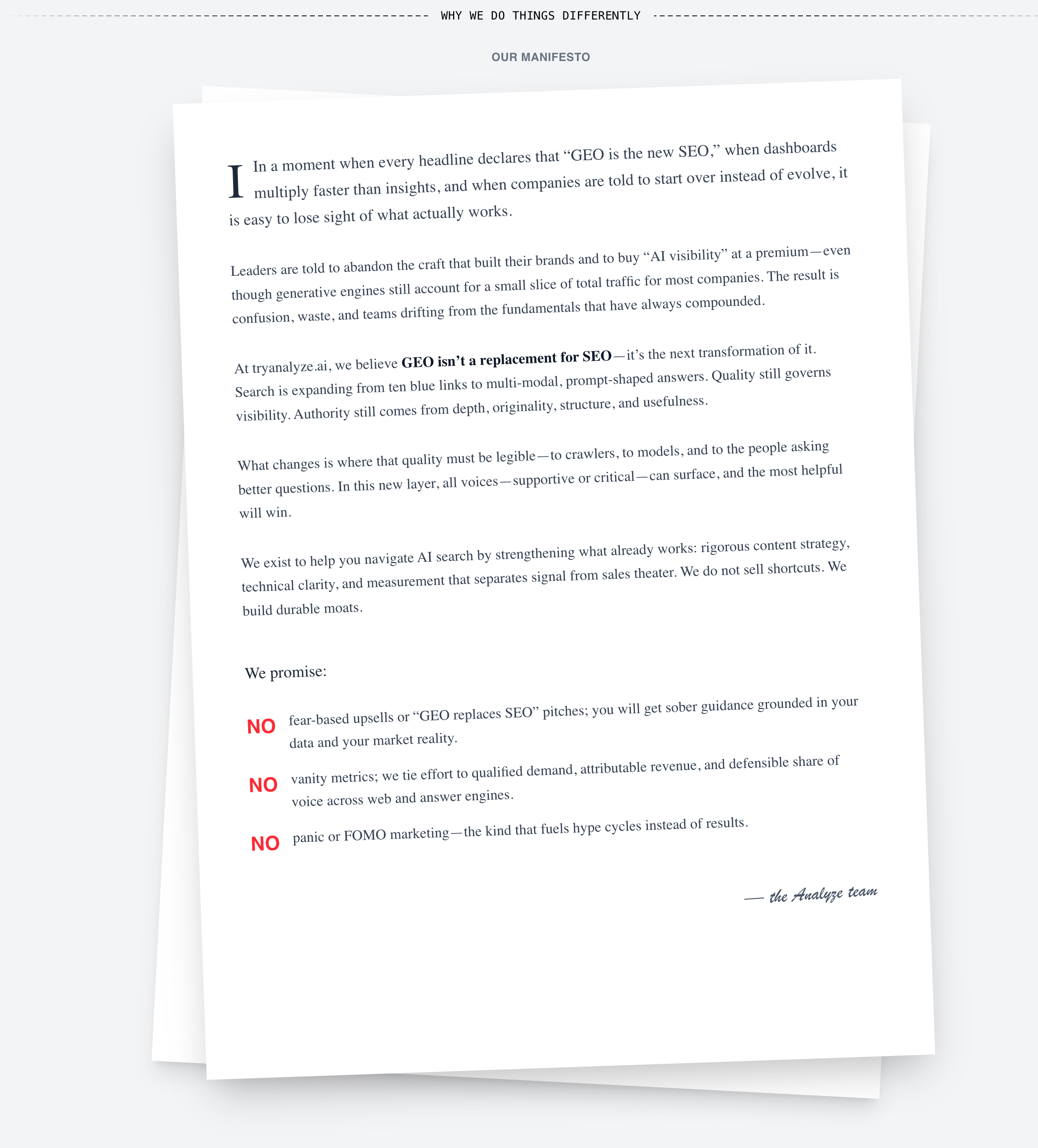
Header: "Why we do things differently" / "OUR MANIFESTO"
The text (formatted like a letter on a page) opens:
*"In a moment when every headline declares that 'GEO is the new SEO,' when dashboards multiply faster than insights, and when companies are told to start over instead of evolve, it is easy to lose sight of what actually works.*
*Leaders are told to abandon the craft that built their brands and to buy 'AI visibility' at a premium—even though generative engines still account for a small slice of total traffic for most companies. The result is confusion, waste, and teams drifting from the fundamentals that have always compounded.*
*At tryanalyze.ai, we believe GEO isn't a replacement for SEO—it's the next transformation of it. Search is expanding from ten blue links to multi-modal, prompt-shaped answers. Quality still governs visibility. Authority still comes from depth, originality, structure, and usefulness.*
*What changes is where that quality must be legible—to crawlers, to models, and to the people asking better questions. In this new layer, all voices—supportive or critical—can surface, and the most helpful will win.*
*We exist to help you navigate AI search by strengthening what already works: rigorous content strategy, technical clarity, and measurement that separates signal from sales theater. We do not sell shortcuts. We build durable moats."*
Then three promises:
- NO fear-based upsells or "GEO replaces SEO" pitches; you will get sober guidance grounded in your data and your market reality.
- NO vanity metrics; we tie effort to qualified demand, attributable revenue, and defensible share of voice across web and answer engines.
- NO panic or FOMO marketing—the kind that fuels hype cycles instead of results.
Psychological Principles I Used For This Manifesto Section
Identity-based persuasion: People don't just buy products; they buy identities. By declaring a worldview, you give visitors a way to join a tribe. This is far stickier than feature-based differentiation.
Commitment and consistency: Once a visitor mentally agrees with your manifesto, they become more likely to continue down the page and eventually convert. Agreeing with values creates psychological momentum.
Contrast with alternatives: The manifesto implicitly criticizes competitors without naming them (after naming them earlier). This one-two punch—specific criticism earlier, principled criticism here—reinforces the positioning.
Why the Manifesto Works
It takes a stance. The manifesto explicitly rejects the "GEO replaces SEO" narrative that competitors promote. This is polarizing—and polarizing is effective. Visitors who believe in the "start over" narrative will leave. Visitors who are skeptical of it will feel found.
It demonstrates domain expertise. The language—"ten blue links," "prompt-shaped answers," "durable moats"—signals deep familiarity with the space. This isn't marketing copy written by someone who just learned the vocabulary; it's insight from someone who's lived in the trenches.
It makes anti-promises. The three "NO" statements are powerful because they're specific and unexpected. Most landing pages promise what they will do. This one promises what it won't do—fear-based upsells, vanity metrics, FOMO marketing. These anti-promises address objections that visitors may not have consciously articulated but deeply feel.
It creates emotional allegiance. By the end of the manifesto, visitors who resonate with the worldview feel like they've found their people. This emotional allegiance is stronger than feature-based attraction because it's identity-based. "This company thinks like I do."
Framework to Use to Nail Your Brand Manifesto
If you want to write your own manifesto:
Open with context: What's happening in the market right now that you disagree with?
State the wrong belief: What do most people/competitors believe that you think is wrong?
State your counterbelief: What do you believe instead? (This is your thesis.)
Explain why: What's the mechanism behind your belief? Why does your counterbelief lead to better outcomes?
Make anti-promises: What will you explicitly NOT do? (These should address anxieties your audience has about vendors in your category.)
Formula for anti-promises: NO [fear they have] + [specific bad practice] + [what you offer instead]
Mistakes to Avoid
- Don't be preachy. The manifesto should feel like conviction, not lecture. If it reads like a sermon, dial back the righteousness.
- Don't be generic. "We believe in putting customers first" is not a manifesto; it's corporate filler. The manifesto should say something your competitors would disagree with.
- Don't make it too long. The manifesto has about thirty seconds to make its point. If it's a wall of text, visitors will skip it. Tighten ruthlessly.
Section 6: CTA Block
After the emotional peak of the manifesto, a CTA block appears. This is strategically placed to capture visitors who've seen enough and are ready to act.
What the Analyze CTA Block Does
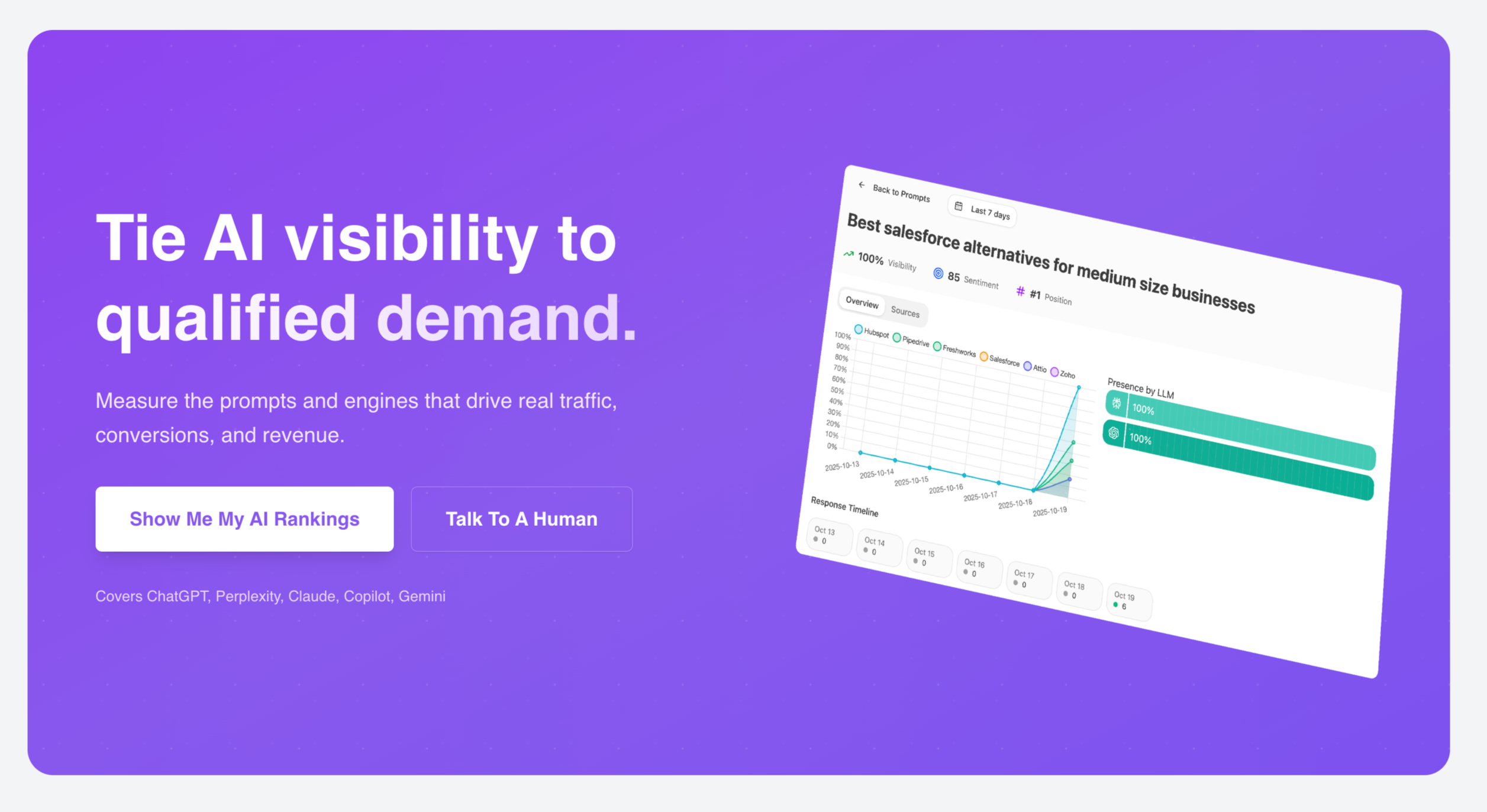
Purple background (standing out from the white/gray of preceding sections).
Headline: "Tie AI visibility to qualified demand."
Subhead: "Measure the prompts and engines that drive real traffic, conversions, and revenue."
Two buttons: "Show Me My AI Rankings" and "Talk To A Human"
Small text: "Covers ChatGPT, Perplexity, Claude, Copilot, Gemini"
Why the CTA Block Works
Visual interruption: The purple background breaks the scroll pattern, signaling "this is important, pay attention." Color contrast is a primitive attention mechanism.
Repetition of headline: "Tie AI visibility to qualified demand" echoes the manifesto's language. Repetition builds familiarity and reinforces the core message.
Same dual-CTA structure: Consistent with the hero, offering both self-serve and sales-assisted paths.
Platform proof: Listing the specific AI engines covered reassures visitors that the product has genuine depth.
Framework to Use to Nail Your Mid-Page CTA
Place after your strongest emotional content (usually after manifesto or solution section).
Use visual differentiation: Background color change, full-width band, increased padding.
Repeat your core headline/value proposition. Visitors may have skimmed earlier. Give them another chance to absorb the message.
Keep the same CTA structure as the hero. Consistency reduces cognitive load.
Add a proof element: Logos, platform coverage, quick stats—something that reinforces credibility.
Mistakes to Avoid
- Don't add new information. The CTA block isn't for introducing concepts; it's for capturing ready visitors.
- Don't make the CTA vague. "Get Started" or "Learn More" are weak. The CTA should describe what the visitor will get.
Section 7: Case Study
After the CTA block, the page transitions to proof. Not testimonials (those come later) but a structured case study with data.
What the Analyze Case Study Does
Header: "REAL RESULTS"
Company: Kylian (with logo)
Pull quote: "We're now observing a 5% conversion rate from AI search traffic and we can attribute it down to the source page and medium. Our goal is to double down on Analyze's recommendations to reduce our over-reliance on Google." — Gilbert Igor, Marketing Coordinator, Kylian
Then detailed results:
- "Best Online English Courses" drove 24 sessions and 2 conversions — a conversion rate of 8.3%, far above the typical blog benchmark of 1-2%.
- "300 Most Common English Words" brought 17 sessions but no conversions, confirming its role as more informational.
- "Websites to Learn English" recorded 13 sessions and 1 conversion, a 7.7% rate—again several times higher than standard content benchmarks.
- By August, the compounding effect was undeniable. AI-sourced sessions had scaled from 200 in May to 697 in August (+15.4% month-over-month) and 1,000+ in November (30% increase from October).
- AI referrals now make up 3% of all site traffic.
- And the growth was resilient—spread across ChatGPT, Copilot, Claude, Gemini, and more—rather than concentrated in a single platform.
Why the Case Study Works
Named company, named person, named title. This isn't an anonymous "Customer A." It's Gilbert Igor, Marketing Coordinator at Kylian. The specificity makes it credible.
Specific metrics, not vague claims. "5% conversion rate from AI search traffic" is verifiable. "Great results" is not. The entire case study is saturated with numbers, percentages, and comparisons.
Comparison to benchmarks. The case study doesn't just state results; it contextualizes them ("far above the typical blog benchmark of 1-2%"). This helps visitors understand what the numbers mean.
Time-series progression. Showing growth over months (May → August → November) demonstrates compounding, which is more compelling than a single snapshot.
Multi-platform resilience. Noting that growth is spread across multiple AI platforms addresses the objection "what if ChatGPT loses market share?"
Framework to Use to Nail Your Case Study Section
Header: Something like "Real Results" or "Customer Success"
Company identification: Logo + company name + link to full case study if available
Pull quote: 1-2 sentences from a named person with a title, stating the key outcome in their words
Specific results: 3-5 data points with exact numbers, percentages, and benchmark comparisons
Time-series data: If possible, show progression over time, not just a snapshot
Visualization: Chart or graph that makes the trend immediately scannable
Mistakes to Avoid
- Don't use anonymous testimonials. "Director at a Fortune 500 company" is weak. Names and titles matter.
- Don't round numbers. "Approximately 5x improvement" is less credible than "4.7x improvement."
- Don't hide the timeline. If results took 6 months, say so. Unrealistic timeline expectations create churned customers.
- Don't cherry-pick without context. If one page converted at 8.3% but another converted at 0%, show both. Cherry-picking undermines trust when discovered.
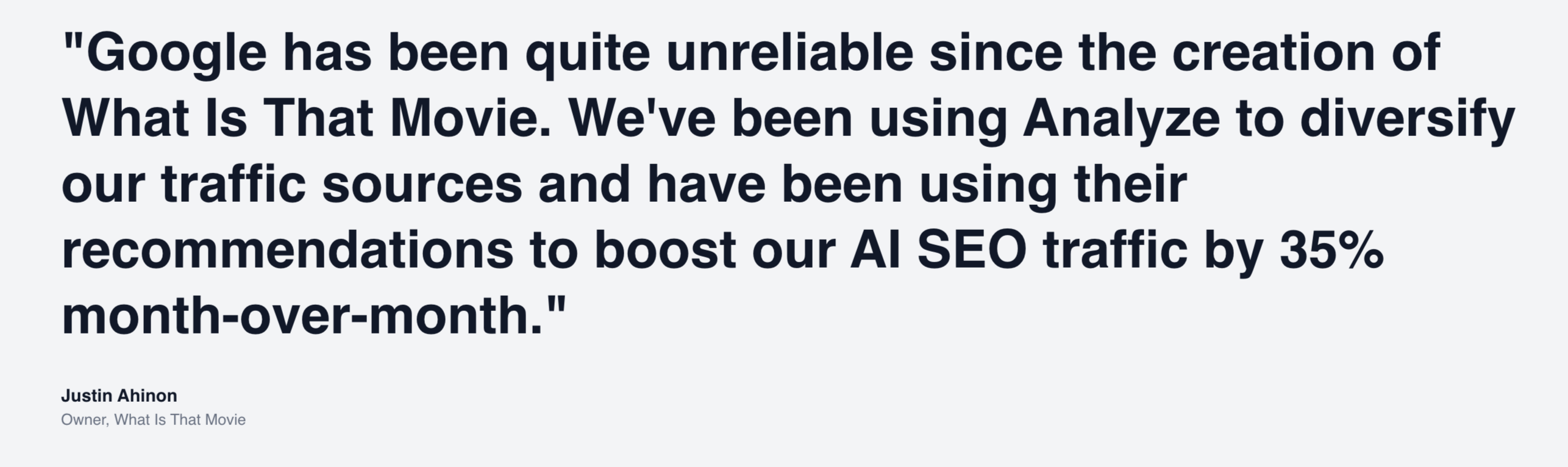
Section 8: Testimonial
After the data-heavy case study, a single testimonial provides social proof in a different register—emotional rather than analytical.
What the Analyze Testimonial Does
Large quote: "Google has been quite unreliable since the creation of What Is That Movie. We've been using Analyze to diversify our traffic sources and have been using their recommendations to boost our AI SEO traffic by 35% month-over-month."
— Justin Ahinon, Owner, What Is That Movie
Why the Testimonial Works
It addresses a fear directly. "Google has been quite unreliable" names the anxiety many visitors feel—dependence on a single traffic source that seems increasingly unpredictable.
It states a specific outcome. "35% month-over-month" is concrete. It gives visitors a mental model for what success might look like.
It's from a recognizable context. "What Is That Movie" is a content site that SEO-minded visitors can imagine. The testimonial feels relevant, not aspirational.
It's positioned after data. The case study provided analytical proof; the testimonial provides emotional proof. Together they satisfy both the rational and intuitive parts of the visitor's brain.
Framework to Use to Nail Your Testimonial Section
Use a full-width format for standalone testimonials. They should feel like a pause, not a sidebar.
Include a specific outcome (number, percentage, timeline) in the quote.
Address a common fear or objection if possible.
Name the person, their role, and their company.
Consider adding a photo if available—faces increase credibility and emotional connection.
Mistakes to Avoid
- Don't use testimonials that just say "Great product!" These do nothing. Testimonials need specificity to be persuasive.
- Don't use too many. One or two high-quality testimonials beat a carousel of twenty weak ones.
- Don't bury them. Testimonials should be scannable during a quick scroll, not hidden in collapsed sections.
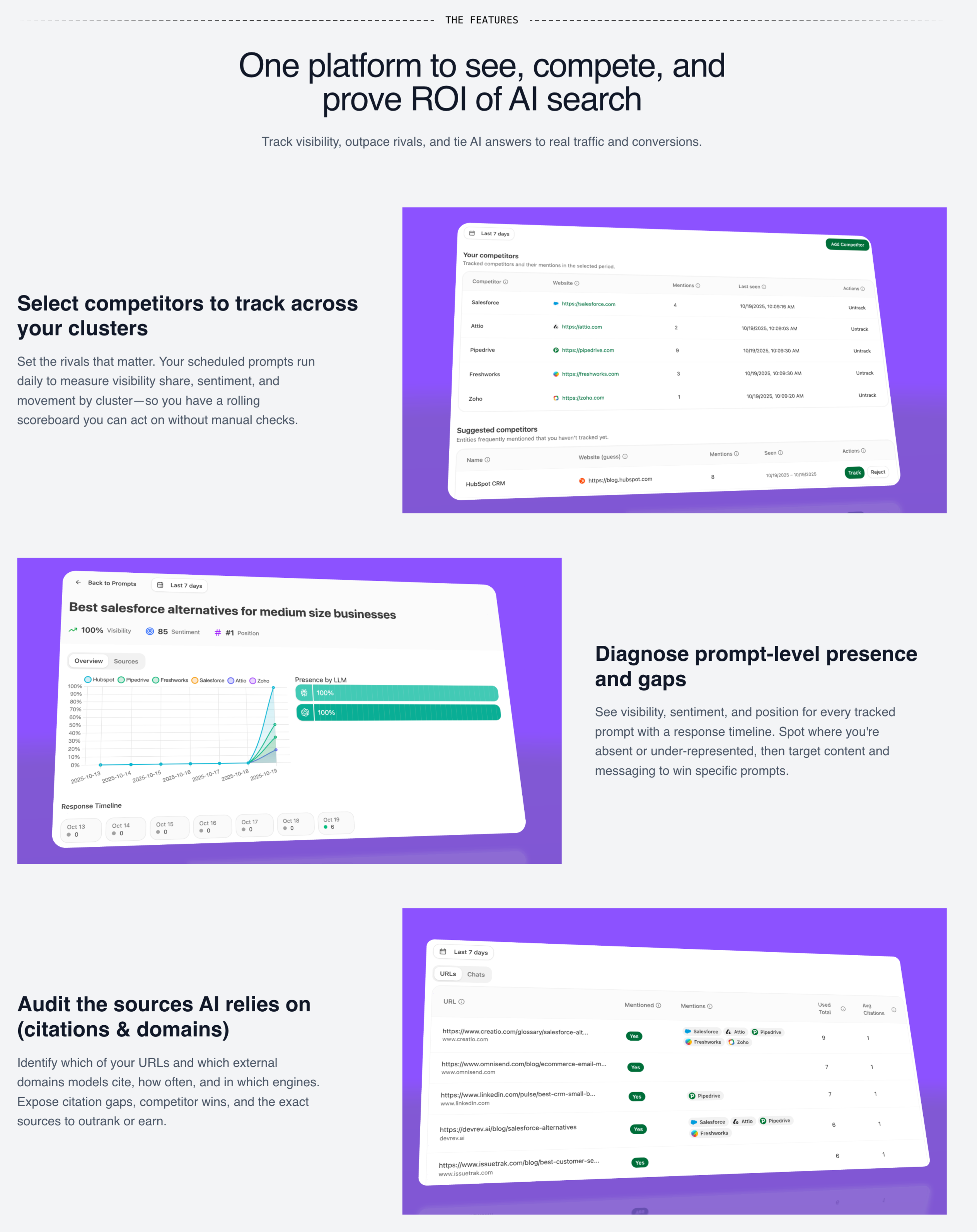
Section 9: Main Features
Having established credibility through problem articulation, solution positioning, manifesto, and proof, the page now transitions to features.
Note: features come late. This is intentional. By this point, visitors have already decided whether the product might be for them. Features are confirmatory, not persuasive.
What the Analyze Features Section Does
Header: "THE FEATURES" / "One platform to see, compete, and prove ROI of AI search"
Subhead: "Track visibility, outpace rivals, and tie AI answers to real traffic and conversions."
Three main features:
- Select competitors to track across your clusters: "Set the rivals that matter. Your scheduled prompts run daily to measure visibility share, sentiment, and movement by cluster—so you have a rolling scoreboard you can act on without manual checks."
- Diagnose prompt-level presence and gaps: "See visibility, sentiment, and position for every tracked prompt with a response timeline. Spot where you're absent or under-represented, then target content and messaging to win specific prompts."
- Audit the sources AI relies on (citations & domains): "Identify which of your URLs and which external domains models cite, how often, and in which engines."
Why this Features Section Works
Outcome-oriented headlines. Each feature is named for what you can do, not what the technology is. "Select competitors to track" tells you the action; "Competitor tracking module" would tell you the noun.
Operational detail. "Your scheduled prompts run daily" tells you how the feature works in practice, not just that it exists.
Benefit phrases embedded. "So you have a rolling scoreboard you can act on without manual checks"—this isn't just describing what it does; it's explaining why it matters.
Visual proof. Each feature includes a screenshot or mockup showing the actual interface. This addresses the "what does it look like?" question that visitors have.
Framework to Use to Nail The Features Section
Header: [One platform to [verb], [verb], and [verb] [outcome]]
Subhead: Expands on the value proposition with specific outcomes
Feature structure:
- Headline: [Verb]-led action you can take
- Description: What it does + how it works + why it matters
- Visual: Screenshot or mockup of the feature
Mistakes to Avoid
- Don't lead with technology. "AI-powered analytics engine" means nothing. "See which AI platforms mention your brand" means something.
- Don't show features without visuals. Feature text without screenshots feels like vaporware.
- Don't forget the "so what." Every feature description should include why the feature matters, not just what it does.
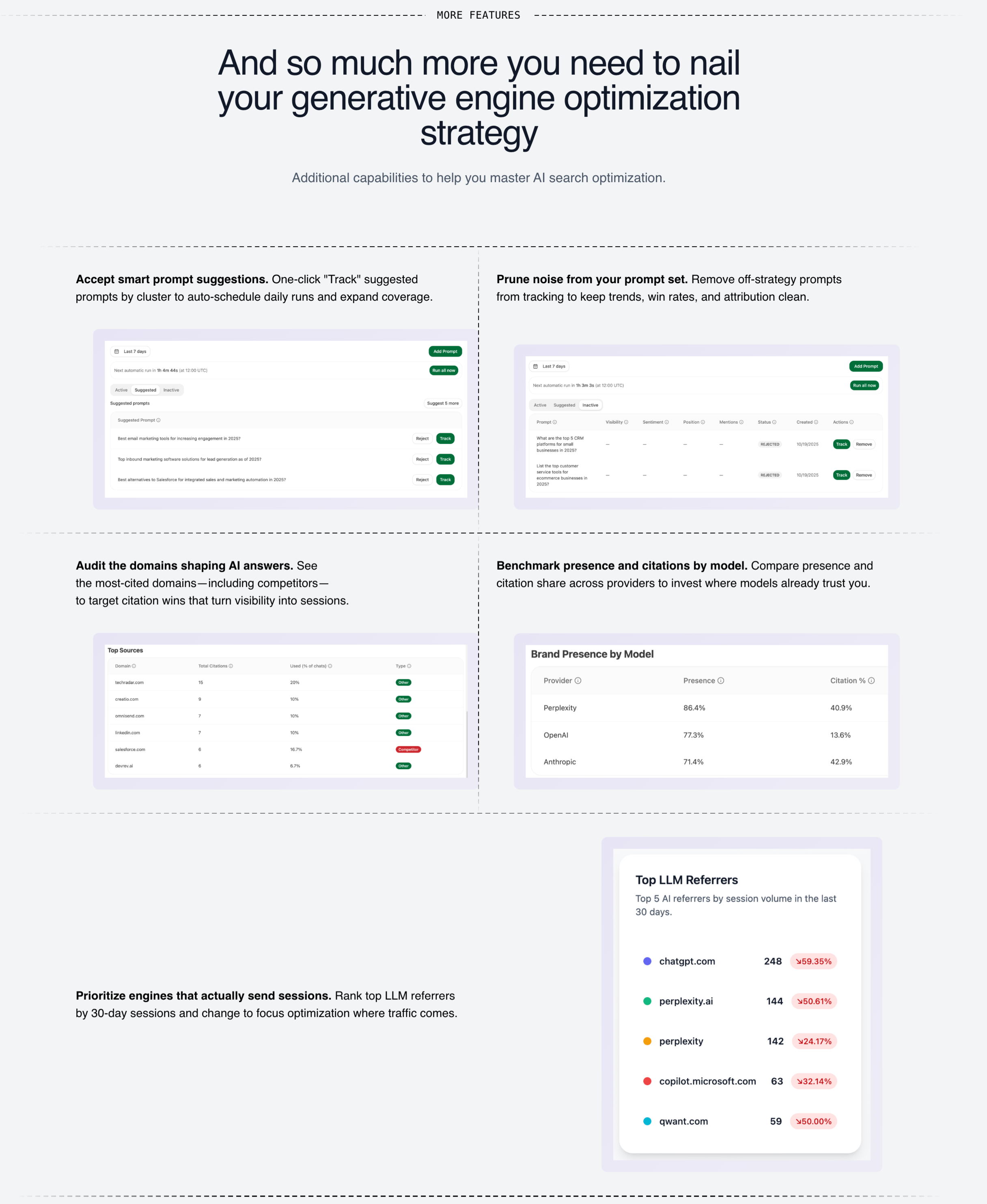
Section 10: More Features
For visitors who want to go deeper, a secondary features section provides additional capabilities.
What the Analyze More Features Section Does
Header: "MORE FEATURES" / "And so much more you need to nail your generative engine optimization strategy"
Subhead: "Additional capabilities to help you master AI search optimization."
Six additional features in a grid:
- Accept smart prompt suggestions: One-click "Track" suggested prompts by cluster to auto-schedule daily runs and expand coverage.
- Prune noise from your prompt set: Remove off-strategy prompts from tracking to keep trends, win rates, and attribution clean.
- Audit the domains shaping AI answers: See the most-cited domains—including competitors—to target citation wins that turn visibility into sessions.
- Benchmark presence and citations by model: Compare presence and citation share across providers to invest where models already trust you.
- Prioritize engines that actually send sessions: Rank top LLM referrers by 30-day sessions and change to focus optimization where traffic comes.
- [Additional feature]: [Description]
Why This Structure Works
It's skimmable. Visitors who want depth can engage; others can scroll past. The grid format allows quick scanning.
It shows completeness. Having more features than fit in the main section signals product maturity.
It addresses edge cases. Features like "prune noise" and "smart prompt suggestions" address operational questions that serious evaluators have.
Mistakes to Avoid
- Don't hide important features here. The secondary features section is for depth, not for burying essential capabilities.
- Don't make it overwhelming. 6-9 features is reasonable. More than that and visitors' eyes glaze over.
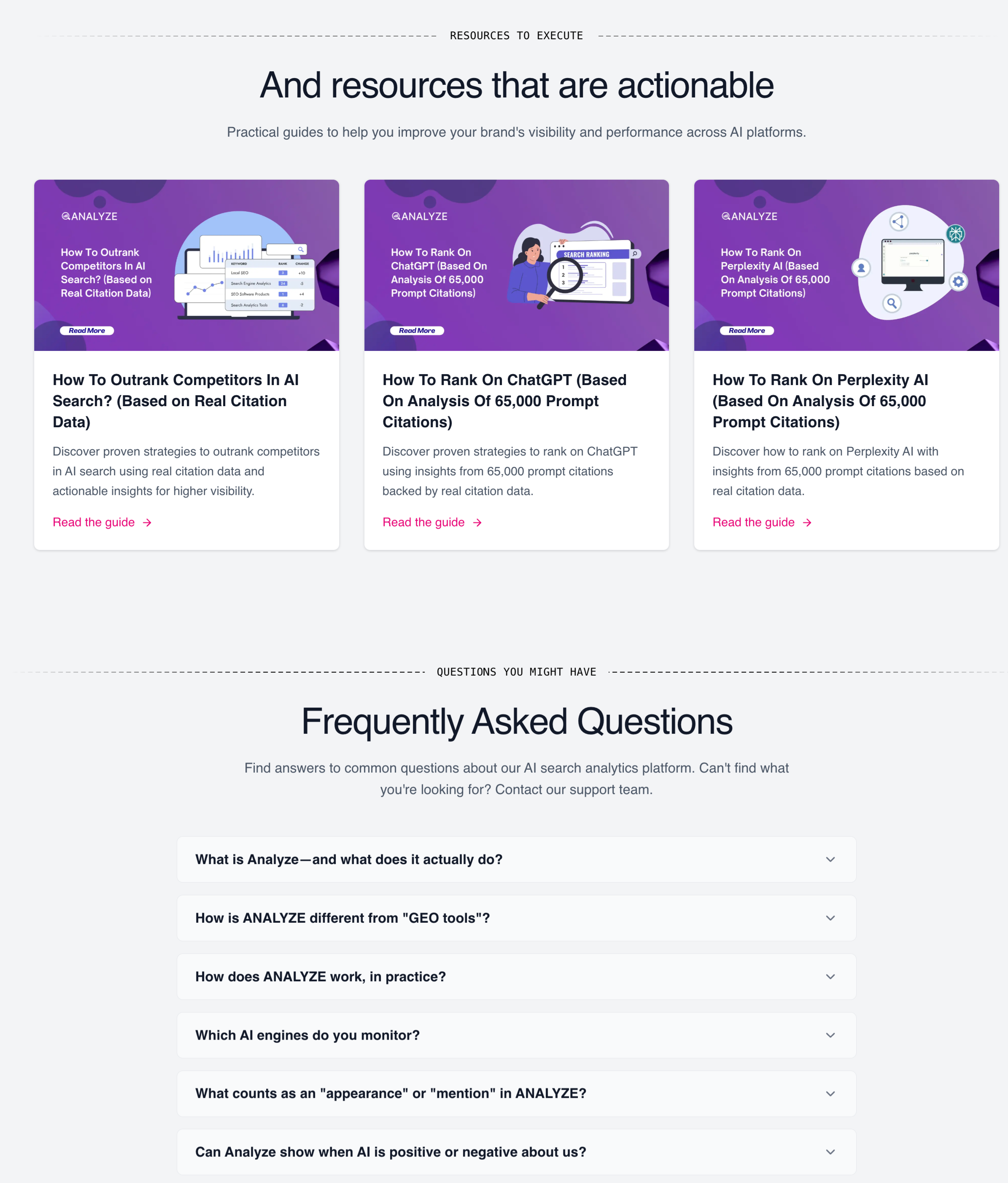
Section 11: Resources + FAQ
Near the end of the page, a resources section and FAQ address remaining questions.
What the Analyze Resources Section Does
Header: "RESOURCES TO EXECUTE" / "And resources that are actionable"
Subhead: "Practical guides to help you improve your brand's visibility and performance across AI platforms."
Three resource cards:
- How To Outrank Competitors In AI Search? (Based on Real Citation Data): "Discover proven strategies to outrank competitors in AI search using real citation data and actionable insights for higher visibility."
- How To Rank On ChatGPT (Based On Analysis Of 65,000 Prompt Citations): "Discover proven strategies to rank on ChatGPT using insights from 65,000 prompt citations backed by real citation data."
- How To Rank On Perplexity AI (Based On Analysis Of 65,000 Prompt Citations): "Discover how to rank on Perplexity AI with insights from 65,000 prompt citations based on real citation data."
Why This Resources Section Works
They provide value before purchase. Visitors who read the guides will learn something useful regardless of whether they convert. This builds goodwill and establishes expertise.
They demonstrate depth. "Analysis of 65,000 prompt citations" signals serious research, not shallow content marketing.
They capture different intents. Visitors researching "how to rank on ChatGPT" might arrive via search and enter the funnel through resources.
The FAQ Section
Questions visible:
- What is Analyze—and what does it actually do?
- How is ANALYZE different from "GEO tools"?
- How does ANALYZE work, in practice?
- Which AI engines do you monitor?
- What counts as an "appearance" or "mention" in ANALYZE?
- Can Analyze show when AI is positive or negative about us?
- Does ANALYZE support multiple regions or languages?
- How often is data refreshed?
- How do I get started?
- Do I need to change my site or install code?
Why FAQ Works
It handles objections at scale. Visitors have questions. If they can't find answers, they leave. FAQ lets you address objections without requiring visitors to contact you.
It supports SEO. FAQ content often matches long-tail search queries, driving organic traffic to the page.
It demonstrates transparency. Having an FAQ suggests you're not hiding anything. Companies that can't answer basic questions look suspicious.
Mistakes to Avoid
- Don't use fake questions. "Why is [Product] the best?" is not a real FAQ. It's marketing disguised as support.
- Don't make answers too long. FAQ answers should be concise. Link to detailed resources for complex topics.
- Don't hide the FAQ in a collapsed section by default. Visitors who want FAQ shouldn't have to hunt for it.
Pulling It All Together: The Psychological Journey
Let me step back and describe what happens psychologically as a visitor moves through this anatomy:
- Seconds 0-5 (Hero): Recognition. "This is for me." The visitor decides to keep reading.
- Seconds 5-15 (Product visualization): Mental model formation. "Oh, this is what it looks like." The concept becomes concrete.
- Seconds 15-30 (Problem section): Pain amplification. "Yes, this is exactly my problem." The visitor feels understood.
- Seconds 30-45 (Solution section): Hope activation. "Maybe this could work." The visitor sees a path forward.
- Seconds 45-60 (Manifesto): Identity alignment. "These are my people." The visitor feels emotional resonance.
- 60 seconds+ (CTA block): Capture high-intent visitors who've seen enough.
- Beyond (Case study, testimonial): Proof. "It's worked for others." Skepticism reduces.
- Beyond (Features): Confirmation. "It does what I need." The visitor validates their forming decision.
- Beyond (FAQ, resources): Objection handling. "My questions are answered." Friction reduces.
- Final CTA: Last chance capture for visitors who scrolled the whole page.
Each section builds on the one before. Skip a step and you create friction. Rearrange them and you break the logic.
Final Thought
The best landing pages don't feel like marketing. They feel like recognition—like someone finally put words to what you've been experiencing, then showed you a path forward.
That feeling comes from a deep understanding of your audience's world, articulate positioning against alternatives, and proof that your approach works.
The anatomy I've described isn't a template to fill in. It's a framework for thinking about what your visitors need to believe at each stage of their journey, and what content earns that belief.
Build the page that would convince you.